Ella’s Cocktails already had the recipe for something special… Beautifully balanced, ready-to-pour craft cocktails that turn any occasion into an experience.
The goal was to build a brand that felt as intentional and refined as the drinks themselves, one that could stand confidently at a wedding bar or on a retail shelf without ever feeling overdesigned.
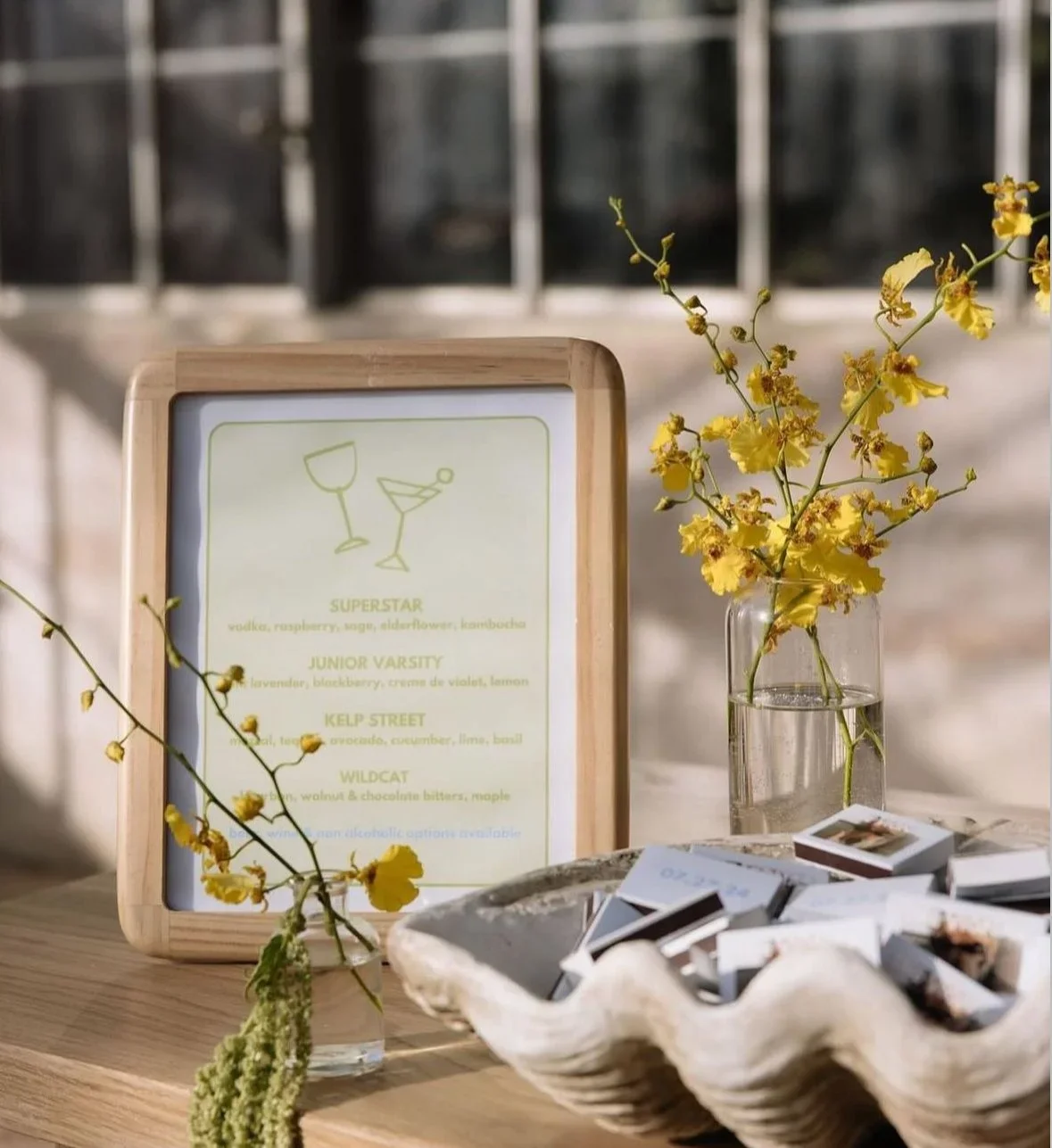
We started with a clear focus on simplicity. The logo was designed to be timeless and adaptable, understated enough to live on uniforms, menus, and event signage without distracting from the atmosphere. It’s confident but quiet, the kind of mark that belongs anywhere without demanding attention.
The color palette and brand guidelines followed that same philosophy: neutral tones with subtle metallic accents, balanced typography, and a tone that feels modern yet warm. The goal was consistency, creating a visual identity that felt cohesive across every platform and every touchpoint.
One of the most distinctive parts of the project was the print experience. The business cards were produced on a thick, velvety stock with a soft-touch finish, giving them a tactile, elevated feel. The logo features an invisible raised spot gloss that catches the light just right, subtle in shade, radiant in sunlight. Every texture, every finish, was chosen to reflect the craftsmanship of the cocktails themselves.
The result is a brand that feels cohesive, grounded, and effortlessly elegant, a visual identity that supports the product rather than overshadows it. Every piece, from the packaging to the business cards, tells the same story: thoughtful design, balanced details, and a lasting impression.
Because great design, like a great cocktail, is all about getting the mix just right.